The online painting critique ran from March 2020 to June 2021. It was replaced by zoom appraisals.

| Artist’s comments: |
| Feedback from members: |
| Artist’s comments: |
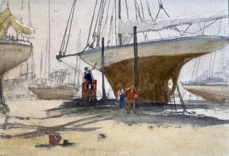
| Feedback from members: Colin Garrod: I definitely prefer your “Returning home” Barbara Reilly: Great composition making the popular subject of boats interesting and, as usual, technically sound. |
| Artist’s comments: |
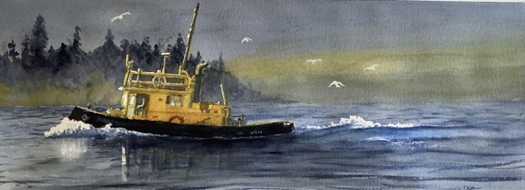
| Feedback from members: Colin Garrod: I like it – very atmospheric! Joy Crouch: Love the colours. |

| Artist’s comments: |
| Feedback from members: Barbara Reilly: The simplicity enhances the subject. Colin Garrod: I like the composition and subtle use of colour. But I think the girl’s ankles could be better defined as they seem rather swollen! |
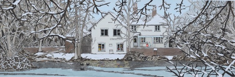
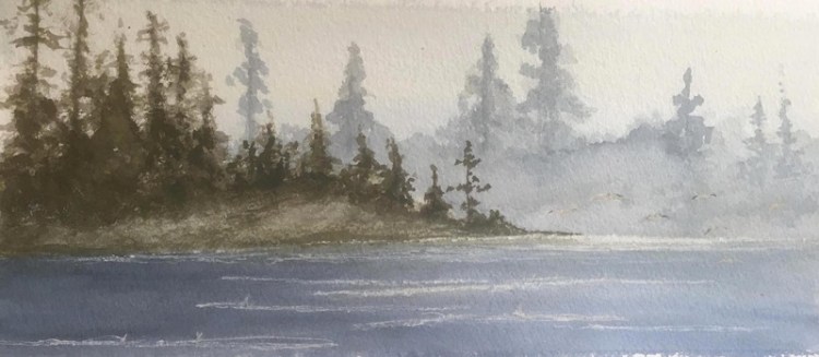
| Artist’s comments: My second attempt at a view of the Cricketers across Stamford Green pond, from a photo taken just after the recent snowfall, when the pond was partly frozen. By popular demand, I have imagined the pub open and introduced people (for soul) and coots (because they are easier to draw than ducks). |
| Feedback from members: Barbara Stevens: This is lovely John. I like the way that you have brought life to the whole scene, and I particularly like the way you’ve painted the interior. Barbara Reilly: I can feel the chill. Brilliant atmosphere |
| Artist’s comments: |
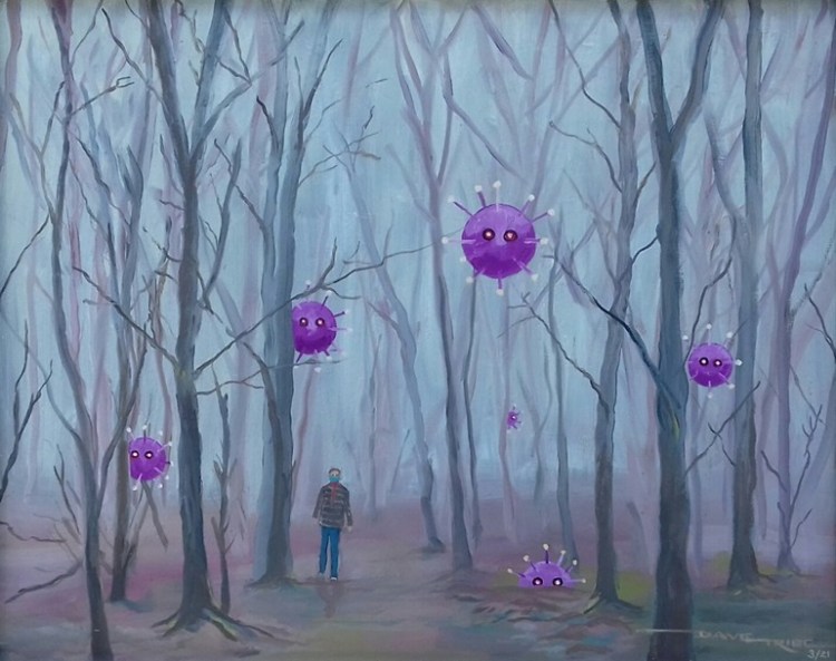
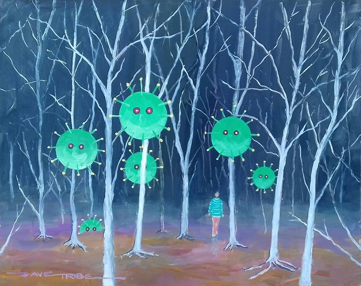
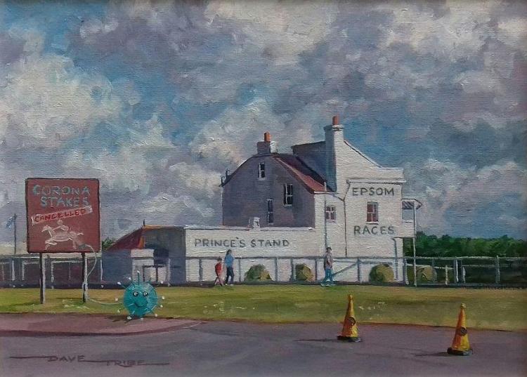
| Feedback from members: Colin Garrod: I hope this isn’t the Indian variant! |
| Artist’s comments: |
| Feedback from members: |
| Artist’s comments: |
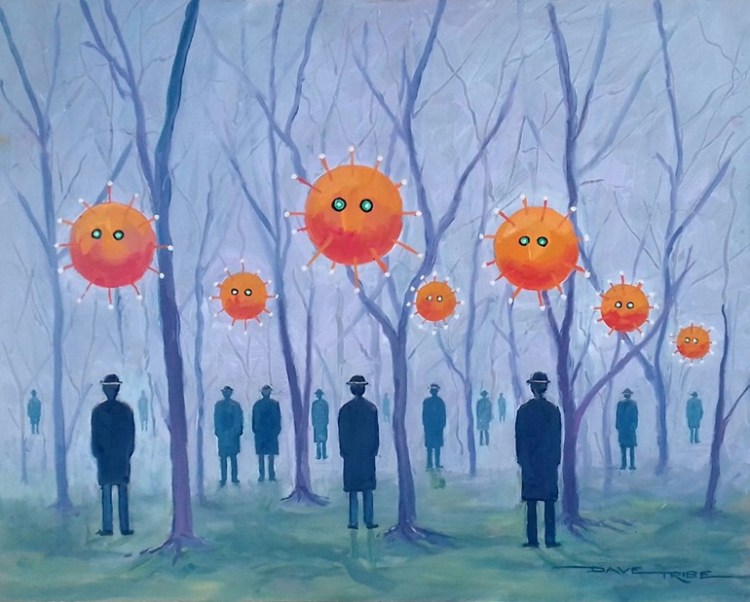
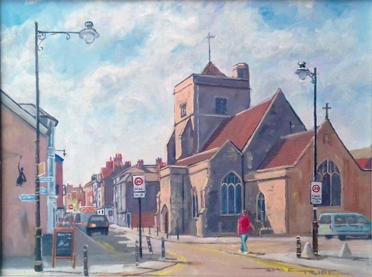
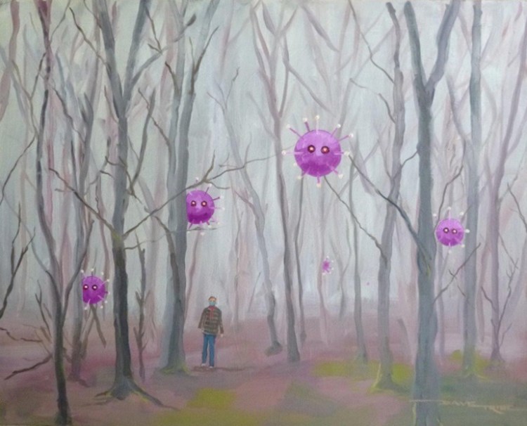
| Feedback from members: Colin Garrod: It is good to see most of the people are still social distancing! Barbara Reilly: As usual, thought provoking, bit too troubling to put on my wall though! |

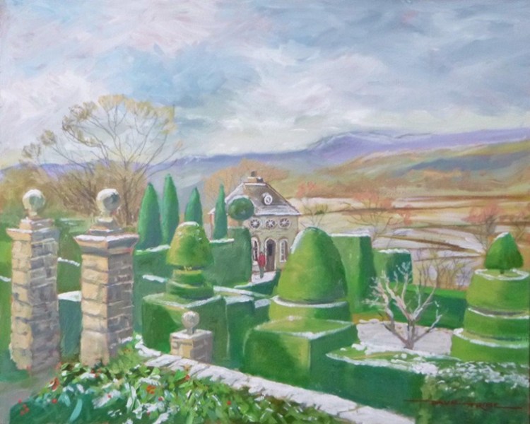
| Artist’s comments: I seem to have given this picture a naïve feeling, but quite unintentionally. Perhaps the building is just too plain from this direction. |
| Feedback from members: Barbara Stevens: I think that I would add some shadows across the building, and paint some ducks on the water. Dave Tribe: Blame Covid for removing the pub’s soul – like so many others. |
| Artist’s comments: |
| Feedback from members: |

| Artist’s comments: |
| Feedback from members: |
| Artist’s comments: |
| Feedback from members: Joy Crouch: With regard to all the snow paintings this is my favourite. I think it could be even better with a couple of figures [just shapes] on the left behind the fence walking away. |
| Artist’s comments: |
| Feedback from members: |
| Artist’s comments: |
| Feedback from members: Barbara Reilly: This use of a topical issue is perhaps one for our local archives. |

| Artist’s comments: |
| Feedback from members: Joy Crouch: This is a good painting. I can feel the sun on the backs of the pedestrians and I like the bright tree placed in front of a dark building on the right. |
| Artist’s comments: |
| Feedback from members: |
| Artist’s comments: |
| Feedback from members: |
| Artist’s comments: |
| Feedback from members: |

| Artist’s comments: |
| Feedback from members: Barbara Reilly: This use of colour and the composition, I feel, generates a relaxing view, with the windmill leading the eye through to the golf course. Glad there are no figures on the course, or sheep! John Lucking: I think this painting works really well – and no Corona Viruses in sight! |

| Artist’s comments: This is the second of three paintings done on an experimental orange ground – at the suggestion of a previous teacher – to get a different and more contemporary effect, he said. He also suggested using magenta or viridian. Perhaps the viridian would be worth trying with this one. I have found the orange both stimulating and really difficult. I think I might generally speaking return to a safer ground such as the lovely bluey grey (?) that Hashim used on Wednesday. Any idea what colour that was? It would be more in keeping with my generally muted palette – although I love experimenting! |
| Feedback from members: Barbara Stevens: I think that the orange works really well, and if I were you, I would explore using other colours rather than revert to grey! Barbara Reilly: I agree that orange has worked well with the interesting colour pallete used. |
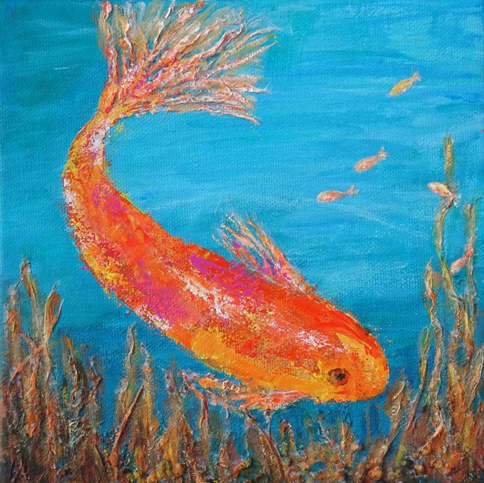
| Artist’s comments: I painted this after watching Rosie’s fish workshop. I changed the design for a square rather than rectangular canvas. |
| Feedback from members: Colin Garrod: Once again, I think your design changes have given a more pleasing effect. Gina Grimwood: Love the colouring & the shine on the back of the goldfish. |
