
| Artist’s comments: Visited on our trip down the Irrawady from Mandalay. | |
| Give feedback | |
| Feedback from members: Colin Garrod: I like your loose painting style. It always leaves something for the viewer to do – avoids having to put in too much detail and must be a useful time-saving technique! John Lucking: I agree with Colin. It would tolerate brighter colours without detriment in my opinion, but I know I like brighter colours than most artists, so many may disagree with me. |
******************************************

| Artist’s comments: This is were the mind goes if you are incarcerated. | |
| Give feedback | |
| Feedback from members: Barbara Reilly: I like the atmosphere of doom and the movement. An appropriate subject for today? Colin Garrod: I didn’t know you could ride a horse! – have you been riding for long? John Lucking: There is a lot of energy in this picture – I like it – especially the sky and clouds. Dave Tribe: Very powerful – and hasn’t your beard grown during the lockdown. George Foxwell: A bit creepy but I like it, Gandalf and the eagles come to mind. |
******************************************

| Artist’s comments: This was painted quite a while ago but never sold. I like the granulation on the roof but not the reflections. | |
| Give feedback | |
| Feedback from members: Colin Garrod: A lovely des res – and I think the reflections are ok! John Lucking: I think this is a very nice and well-composed watercolour painting, but (now you have pointed it out) the reflections in the water are not the best bit. It looks like you have used white paint, rather than leave some paper unpainted, which has made it look a little heavier than you probably intended. George Foxwell: Nice subject and composition. Getting realistic reflections in water is difficult but I think yours are ok. I’m impressed that you have done this in watercolour. Dave Tribe: Very well executed – particularly the water which looks like it’s moving. One or two figures on the bridge would bring it to life. Gina Grimwood: This is a very attractive subject & I agree with most of the above comments including Dave’s with figures on the bridge. Perhaps the reflection of the light green bush to the left of the bridge needs lightning a little to show it up. I think I would have left the first wash as unpainted paper to suggest the lights. |
******************************************

| Artist’s comments: I have just done this sketch, which awaits feedback before I progress further. | |
| Give feedback | |
| Feedback from members: Joy Crouch: A very good honest likeness. Would there have been some darker shades of grey amongst the white of the hair to give it more substance. Barbara Reilly: I look forward to the next stage of this work. John Lucking: I suggest that a portrait painter would do well to discard honesty and embrace flattery if he hopes for fame and commissions. On a more practical note, have you tried to capture likenesses with fewer lines or marks. The image looks a bit overworked to me. (Not that I could do a better portrait of anyone!) |
******************************************
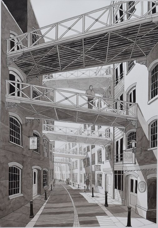
| Artist’s comments: I’m quite pleased with how this turned out. I think I succeeded in suggesting bright sunlight by using strong shadows. | |
| Give feedback | |
| Feedback from members: Joy Crouch: I love it, love it, love it! Colin Garrod: I particularly like the graduation in tone with distance. Its even better than your previous one. You obviously know about steel structures! Ed Hilton: I like the shapes formed by the shadows and the amazing perspective you have created. Barbara Reilly: Impressive, striking artwork as usual. |
******************************************

| Artist’s comments: Painting on canvas done during lockdown of some Tulips that appeared in Spring. | |
| Give feedback | |
| Feedback from members: Colin Garrod: A nice painting – and I like the tonal contrast – Well done! John Lucking: You have such a good expression on light. Good colours too. |
******************************************
| Artist’s comments: | |
| Give feedback | |
| Feedback from members: Colin Garrod: A beautiful painting with lovely rich colours – you really are quite talented! |
******************************************

| Artist’s comments: | |
| Give feedback | |
| Feedback from members: John Lucking: Although all the details are modern, this somehow reminds me of a room in a roman villa, or the ruins of Pompeii, with a picture of a mischievous minor deity on the wall. |
******************************************

| Artist’s comments: We met this herd of Cape Buffalo in Botswana near the Chobe River. | |
| Give feedback | |
| Feedback from members: Barbara Reilly: You have certainly captured the size of the herd. Joy Crouch: Good different choice of subject. Like the handling of recession in the painting but would have preferred three animals in the foreground. John Lucking: I like the way the foreground animals confront the viewer. The legs of the mid-ground animals are not quite right. The almost seem to dangle from the animals. |
******************************************
| Artist’s comments: A different subject for me – my grandaughter is horse mad so this is for her! | |
| Give feedback | |
| Feedback from members: Barbara Reilly: Really like the misty colours giving atmosphere. Lucky grandaughter. |
******************************************

| Artist’s comments: | |
| Give feedback | |
| Feedback from members: Colin Garrod: A lovely interesting painting with an amusing slant! Barbara Reilly: Is that Henry on the bike? John Lucking: A great idea for a picture. |
******************************************
| Artist’s comments: This was painted from a Pixabay photo reference and perhaps I should have not copied the background so literally as I am not sure it works so well for a painting. Painting fabric is a real challenge for me and were reworked a few times before I decided to leave it as you see here where at least it cannot be confused for anything else. | |
| Give feedback | |
| Feedback from members: Joy Crouch: I love the figures. You just need to tone down the grass and add some shade, under the hats etc. Colin Garrod: I too, like the figures but think the grass could be toned down and perhaps the figures could have a little more variation in tone particularly under the hats. John Lucking: The people are really well done. The background lets the picture down. I would get rid of the path and tone the green down a lot, or even just paint a neutral background to concentrate our eyes on the figures. |
******************************************

| Artist’s comments: This is a large (A1 size) picture, based rather loosely on many recent walks around the common. I may have another go. | |
| Give feedback | |
| Feedback from members: Dave Tribe: Very, very effective – one of your best Joy Crouch: Fabulous colours. I love the ‘fantasy’ style of it. Ed Hilton: Very interesting colours and design. |
******************************************
| Artist’s comments: Installation for VE Day | |
| Give feedback | |
| Feedback from members: |
******************************************

| Artist’s comments: | |
| Give feedback | |
| Feedback from members: Joy Crouch: Lovely colours but maybe the fence could be lower. Also higher grasses in the foreground to break up the line of the lower part of the fence. Colin Garrod: Yes – I think the fence acts too much much as a barrier, so could be lower and perhaps a bit darker – but otherwise lovely. |
******************************************
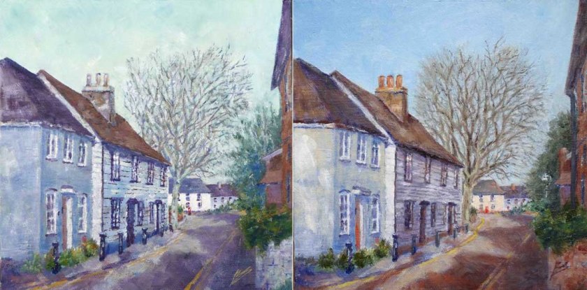
| Artist’s comments: I painted the left-hand picture a couple of years ago, but never liked it. I decided to see if I could improve it when I came across it again last week. | |
| Give feedback | |
| Feedback from members: Dave Tribe: A really great improvement. In spite of Picasso saying ‘A painting is never finished – it is merely abandoned’, I’ve found that it often pays to go back to an old painting and transform it to something better. Well done! Barbara Reilly: The first painting was pleasing, but yes, I think a fresh look has improved the scene. It was well worth another go. |

- Artist: Tony Devivo / Title: Pss! Can you see that cat anyone? / Medium: Pencil/Solvent
| Artist’s comments: | |
| Give feedback | |
| Feedback from members: Barbara Stevens: Brilliant! You are so talented Tony. |
******************************************

| Artist’s comments: | |
| Give feedback | |
| Feedback from members: |
******************************************

| Artist’s comments: | |
| Give feedback | |
| Feedback from members: Joy Crouch: Congratulations Tony on your 3 outstanding pictures of those majestic creatures. Ingeborg Neale: I like all 3 pictures. Is number 1 on lockdown? Great expression, very sensitively painted. |
******************************************
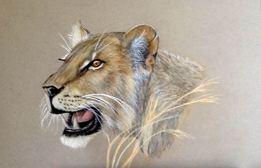
| Artist’s comments: | |
| Give feedback | |
| Feedback from members: Richard Seymour: Tony you are a really good artist and create pictures people would like to buy. Please put some of your pictures in our exhibitions. George Foxwell: Of the three Big Cats this is my favourite. The colouring and the rendition of the fur is truly of professional standard. Richard is right, you should sell them. You have even impressed my wife (with the Artwork) and she’s not easily impressed. Colin Garrod: Yes – this my favourite too – Well done! |
******************************************

| Artist’s comments: | |
| Give feedback | |
| Feedback from members: Barbara Reilly: Your paintings of the three cats are striking. The use of coloured pencils has worked perfectly, as has the watercolour in Cat 3. The background colours suit the subjects. The many hours taken to complete these cats was worth while. |
******************************************
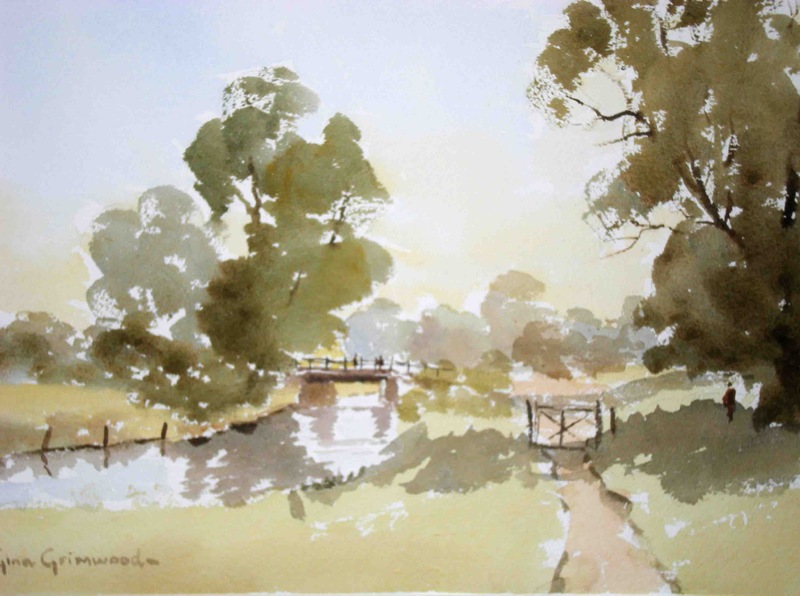
| Artist’s comments: Painted from a sketch done on location. | |
| Give feedback | |
| Feedback from members: Joy Crouch: The appeal of this lovely painting lies in its simplicity. Ed Hilton: I like the way you’ve captured the light and shadow with such simplicity. John Lucking: I really like this picture. You’ve made it look easy, but we know it isn’t. You have the best greens. Shows how toned down greens need to be. I’ll try to remember next time I paint grass and trees. |
******************************************
