******************************************

| Artist’s comments: Something new, something blue | |
| Give feedback | |
| Feedback from members: Barbara Reilly: I like the freedom and movement in this painting. Joy Crouch: I know it is an obvious remark to make but both the cherries and the birds are fighting for prominence. The birds should win. Knock back the background attractive though it is. |
******************************************

| Artist’s comments: | |
| Give feedback | |
| Feedback from members: Joy Crouch: Brilliant again! Am I going to be the only person commenting on these wonderful pictures? Barbara Reilly: I am sure we are all appreciating your art work. This dog gives us a added smile too. |
******************************************
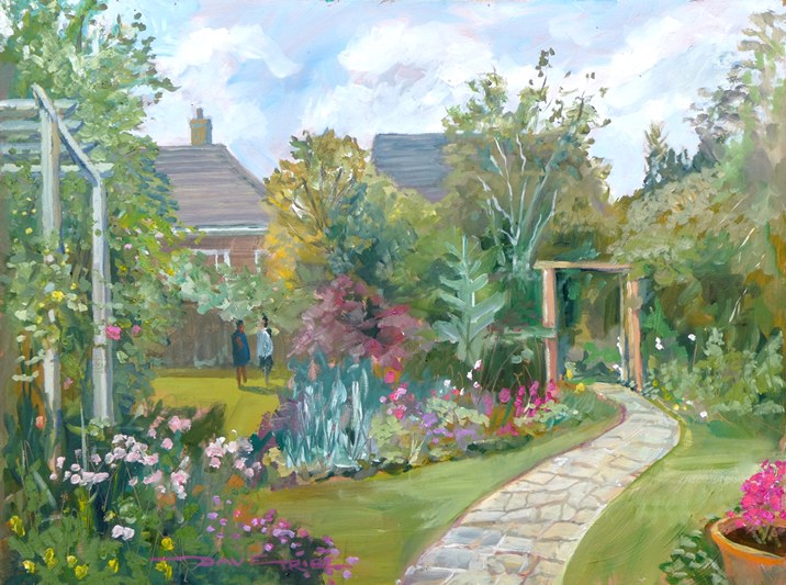
| Artist’s comments: | |
| Give feedback | |
| Feedback from members: Gina Grimwood: A very attractive garden painting-I like the composition especially the way the path leads us to the wooden arch.To give it a sunnier look I think a shadow across the foreground of the path & under the archway would help. |
******************************************
| Artist’s comments: | |
| Give feedback | |
| Feedback from members: Joy Crouch: Stop now Tony, we’re running short of superlatives! |
******************************************
| Artist’s comments: My second Epsom Common picture. A bit less “trippy” than my first one (at least the leaves are green now.) I am reasonably happy with it, but there are a few things I would do differently if I can summon up the energy to attempt version 3. | |
| Give feedback | |
| Feedback from members: Joy Crouch: This is an attractive picture. My sister loves it and she is hard to please. Dave Tribe: Rather clever composition – works well – would make good poster or book cover. |
******************************************

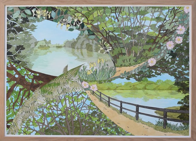
| Artist’s comments: | |
| Give feedback | |
| Feedback from members: |
******************************************
| Artist’s comments: | |
| Give feedback | |
| Feedback from members: Colin Garrod: Une belle peinture d’un site iconique intéressant. |
******************************************
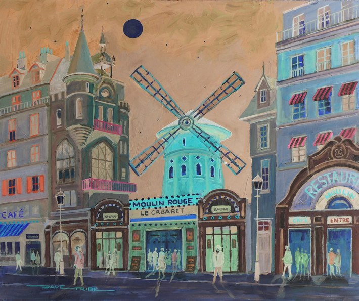
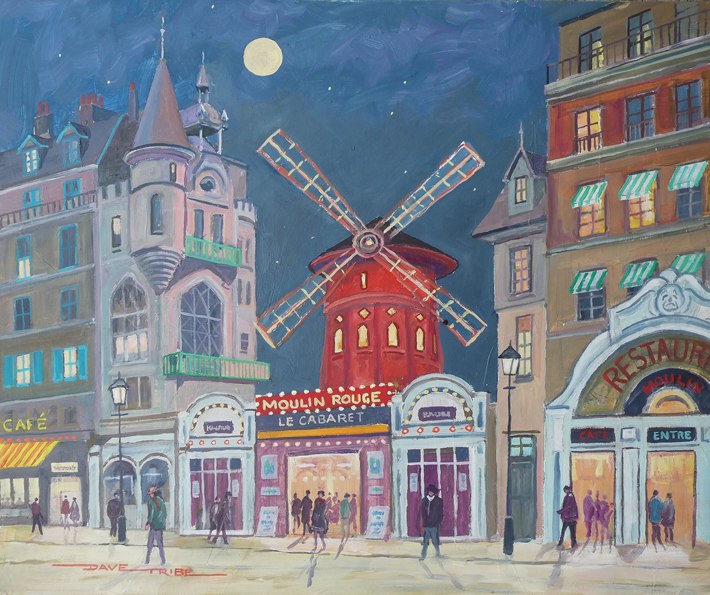
| Artist’s comments: The negative version of Moulon Rouge converted on My PC – turned out rather better than I expected – always fun to do. | |
| Give feedback | |
| Feedback from members: Barbara Reilly: An interesting conversion. It is good to get away from the run of the mill colours! |
******************************************

| Artist’s comments: | |
| Give feedback | |
| Feedback from members: Joy Crouch: Wow..the art of painting dark against bright is such a powerful technique to use. |
******************************************

| Artist’s comments: I painted this from a photo that I took on Ashtead Common in April. | |
| Give feedback | |
| Feedback from members: George Foxwell: I’m impressed, good composition, excellent subject and a lovely play of light and shadow. Colin Garrod: A lovely painting – and I guess you positioned the majestic Oak in order to give it sufficient emphasis. I particularly like the inclusion of the people in the distance. Gina Grimwood: A lovely painting but I feel it’s sloping towards the left a bit.I think it’s mainly the shadow of the foreground tree as it goes towards the corner. Love the colours. Barbara Stevens: Thanks Gina – I’ve altered the shadow. |
******************************************

| Artist’s comments: | |
| Give feedback | |
| Feedback from members: Joy Crouch: The water droplets are good but I would have preferred a different tone on the body and paw [more ginger perhaps] as it is too close [in my opinion] to the colour of the background. George Foxwell: I recognise that this is supposed to be a critique page but there is no way that I’m giving any criticism, I think this is terrific, where do you get the ideas from? |
******************************************
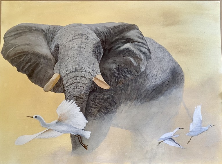
| Artist’s comments: | |
| Give feedback | |
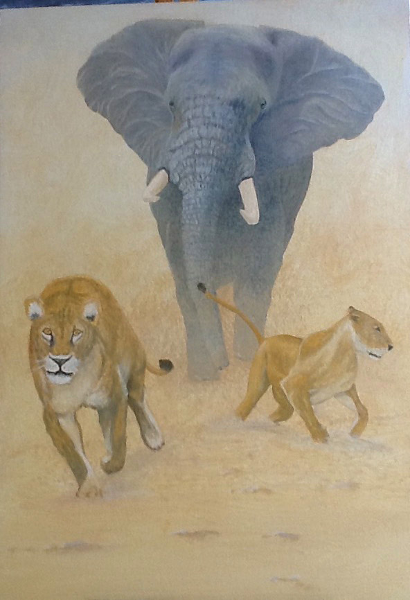
| Feedback from members: Joy Crouch: Brilliant painting again, I particularly like the elephant and the way the dusty ground is portrayed. George Foxwell: Impressive elephant and nice composition. I’d love to see the original just to see how you’ve done it. I’m envious. |
******************************************

| Artist’s comments: | |
| Give feedback | |
| Feedback from members: Colin Garrod: I like the contours and the far distance but I think more recession in tone would perhaps increase the perspective and depth. George Foxwell: I really like the composition and the vertical landscape format fits the subject beautifully. My eye was caught by the dark hill middle left of the work. I was looking for something but there was nothing there. I think would have abandoned reality and added something, maybe a chapel, a cluster of farm buildings or some farm animals. Tony Devivo: Great picture. Love the recession don’t change a thing. Barbara Reilly: I like how the tiny figure calmly leads us through the landscape. |
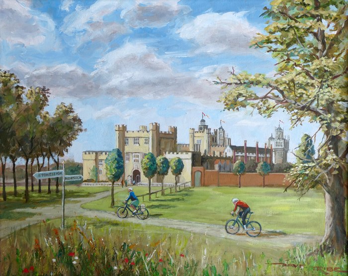
| Artist’s comments: | |
| Give feedback | |
| Feedback from members: Barbara Stevens: Nonsuch Palace makes a really good subject. I think that I would remove the signpost – my eye keeps being drawn to it instead of the palace. Colin Garrod: I like this as it is – so no need to remove the signpost! Dave Tribe: Thanks – Sign gone, looks much better |
******************************************
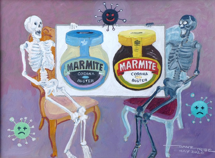
| Artist’s comments: My latest, and maybe last, in my Corona virus series. It’s called ‘LOVE IT OR HATE IT’ – the same question applies to the painting! | |
| Give feedback | |
| Feedback from members: |
******************************************
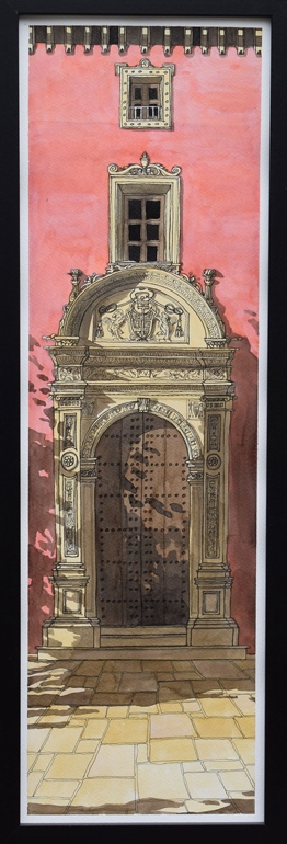
| Artist’s comments: Based on photos from my holiday in Granada and Seville in 2018. The shadows are from trees outside the frame. | |
| Give feedback | |
| Feedback from members: Barbara Stevens: This is lovely – you’ve captured the sunlight and the atmosphere really well. Colin Garrod: Yes I agree! and it’s a slight departure from your usual accomplished style? Gina Grimwood: I really like this painting- especially the cast shadows. Joy Crouch: The subject really suits your style of painting. More please. Barbara Reilly: I find the composition and execution extremely polished. |
******************************************

| Artist’s comments: | |
| Give feedback | |
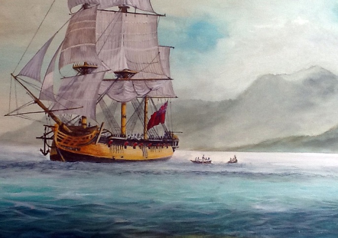
| Feedback from members: Dave Tribe: I really like your recent ship pictures but I hope they haven’t got Coronavirus on board! George Foxwell: This is marginally my favourite of your two ship paintings. Both are impressively good but the composition and viewpoint on this one does it for me. |
******************************************
| Artist’s comments: | |
| Give feedback | |
| Feedback from members: |
******************************************

| Artist’s comments: I think this has come out a bit too neat. If I do it again, I’ll try to scruff it up a bit. | |
| Give feedback | |
| Feedback from members: Barbara Reilly: Neat is your distinctive style, so do you need to change? Barbara Stevens: It would be very interesting to see you tackle the same subject in a completely different style! Colin Garrod: I don’t actually think it looks like The Cricketers! Perhaps it’s partly because it lacks sufficient tonal variation to give it perspective? |
******************************************

| Artist’s comments: Visited on our trip down the Irrawady from Mandalay. | |
| Give feedback | |
| Feedback from members: Colin Garrod: I like your loose painting style. It always leaves something for the viewer to do – avoids having to put in too much detail and must be a useful time-saving technique! John Lucking: I agree with Colin. It would tolerate brighter colours without detriment in my opinion, but I know I like brighter colours than most artists, so many may disagree with me. |
******************************************

| Artist’s comments: This is were the mind goes if you are incarcerated. | |
| Give feedback | |
| Feedback from members: Barbara Reilly: I like the atmosphere of doom and the movement. An appropriate subject for today? Colin Garrod: I didn’t know you could ride a horse! – have you been riding for long? John Lucking: There is a lot of energy in this picture – I like it – especially the sky and clouds. Dave Tribe: Very powerful – and hasn’t your beard grown during the lockdown. George Foxwell: A bit creepy but I like it, Gandalf and the eagles come to mind. |
